(Click on any design to enlarge)
Here I sketched out some initial ideas for potential designs for rebranding of the logo for Summer Sundae festival.
A logo is a "symbol or other small design adopted by an organization to identify products, uniform, vehicles" in this case a music festival.
The above images shows the development of my initial logo design in the top left hand corner.
I erased this images background using the background eraser in photoshop and then moved it into illustator to create a silohette which I will incorporate as a ray coming off the sun in my design. This is a good concept because it reflects that Summer Sundae is a music festival. Anothe concept for a logo design was to manipulate text on to stand alone as a logo. However when researching this further logos tended to be symbols rather than text.
This was more effective than the previous design however it is not clear enough that the texture is ice-cream and therefore this is not a successfull.
I then took the previous concept of incorporating a texture into a logo and developed it further by creating one main text saying 'Summer Sundae Weekender'. I then created another layer of words such as 'love', 'peace', 'communal living', 'gender equality' and 'creativity' which reflected the era of the chosen theme 'The Summer of Love'. I then created a clipping mask.
This was not successful as the font inside the main writing was not clear enough for the reader, especially if it was going to be a smaller size when put into my poster, website and sticker designs.
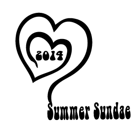
This is my initial design for the festival. I have chosen a heart to symbolise the theme of the festival 'The Summer of Love'. However to improve this design I then repeated the shape and added some colour to create more depth to the design.
This is my initial design for the festival. I have chosen a heart to symbolise the theme of the festival 'The Summer of Love'. However to improve this design I then repeated the shape and added some colour to create more depth to the design.
I then looked at logos such as nike and considered taking the text out of my design. I preferred this because most logos are known for symbols rather than text.
Adding the repetition of hearts layered on top of one another added more depth to the design.


No comments:
Post a Comment